Toast
Toast is a lightweight status overlay for short, self-contained messages. It maps to
Bootstrap 5 toast and is meant for confirmations, quiet errors, and other notices
that should not steal focus the way a modal does.
Toasts mount on the shared overlay portal, not inside the triggering layout cell, so
position them with Bootstrap's fixed-position utilities on class_name (for example
position-fixed top-0 end-0 m-3). They can auto-dismiss after a short
interval so the portal does not collect stale messages.
Basic usage

def demo() -> None:
    with bs.scope():
        notice = bs.toast(
            "Record saved",
            is_open=True,
            icon="check",
            class_name="position-fixed top-0 end-0 m-3",
        )
        ui.button("Save", on_click=notice.show)
Call toast.show() to push the notice onto the portal, or construct it with
is_open=True when the message should appear as soon as the page is ready.
Live example
The snippet below is exactly what the demo service runs. The highlighted
demo() function is the same source the demo executes, not a rewritten copy.
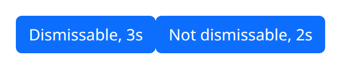
def demo() -> None:
    with bs.scope():

        def show_dismissable() -> None:
            bs.toast(
                "Saved",
                duration=3000,
                dismissable=True,
                class_name="position-fixed top-0 end-0 m-3",
            )

        def show_timed() -> None:
            bs.toast(
                "Auto-hide",
                duration=2000,
                dismissable=False,
                class_name="position-fixed top-0 end-0 m-3",
            )

        bs.button("Dismissable, 3s", on_click=show_dismissable)
        bs.button("Not dismissable, 2s", on_click=show_timed)
Options
Open state and show()
is_open is the Python flag for visibility. show() is the convenience method that
opens an existing instance, which is the usual pattern from a button or a save
handler. Keep one instance per message kind if you expect repeats; showing the same
toast again is cheaper than building a new tree each time.
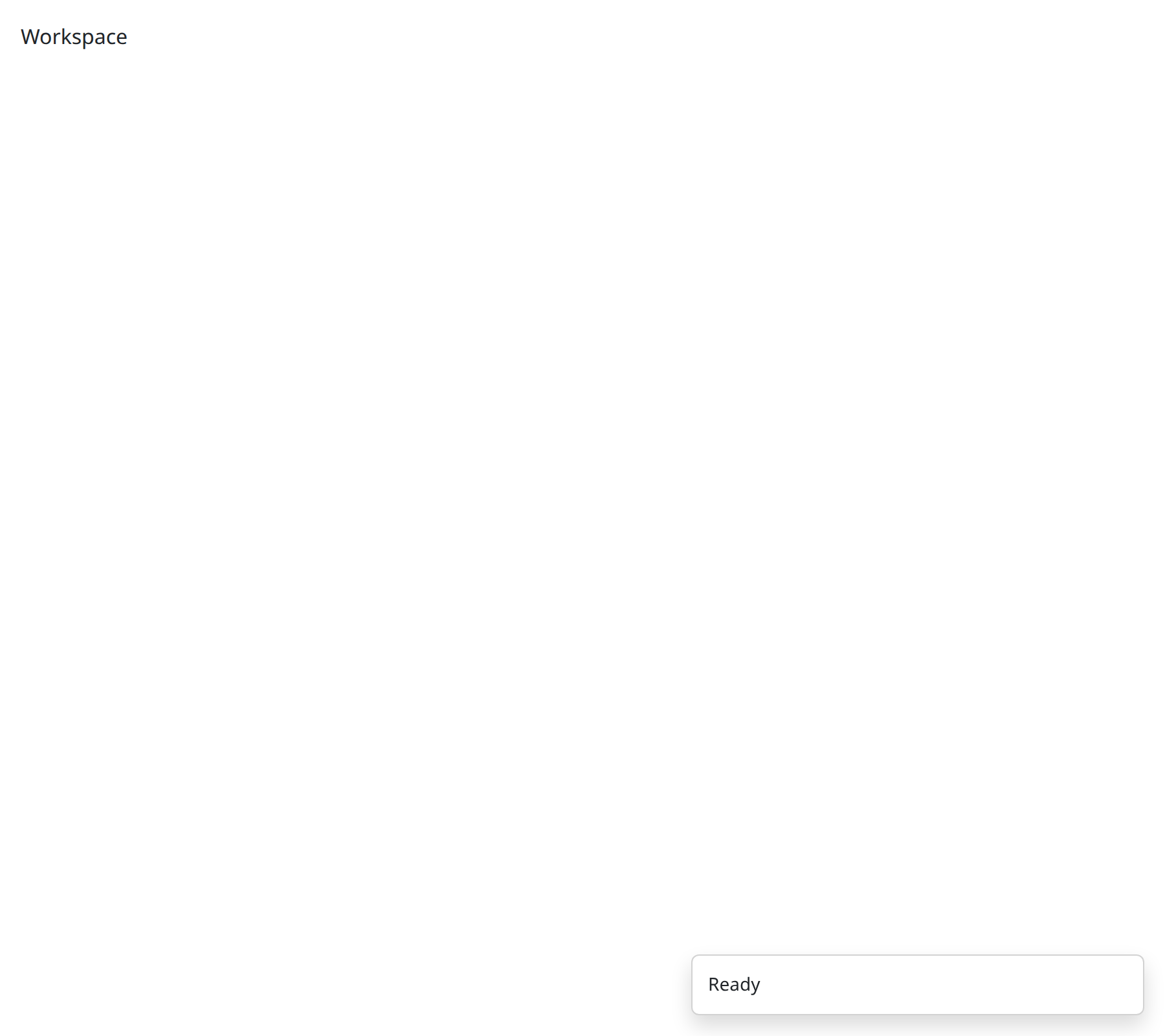
def demo() -> None:
    with bs.scope():
        bs.toast(
            "Ready",
            is_open=True,
            class_name="position-fixed bottom-0 end-0 m-3",
        )
        ui.label("Workspace")
Set is_open=False when the toast should wait for an action. Set it True for
page-level notices that are already true at construction.
Icon
icon draws a status glyph beside the message. Use it to distinguish success from
warning at a glance, especially when several toasts can stack. Keep the copy able
to stand alone; the icon is reinforcement, not the only signal.
Placement
Position the toast with Bootstrap's fixed utilities on class_name: for example
position-fixed top-0 end-0 m-3 puts the stack in the top-right corner, and
bottom-0 end-0 pins it to the bottom-right. Pick one corner for the app and
stay there so users know where to look. Because the toast lives in the overlay
portal, parent overflow and z-index on local cards do not clip it — but the
portal does mean a local wrapper element cannot position it, so the utilities
must be on the toast itself.
Auto-dismiss and the overlay portal
After a toast is shown it can auto-dismiss, which is the right default for success and info. Errors that the user must acknowledge should stay until dismissed, or they should be an Alert in the page instead. The portal is shared with other overlays (popovers, tooltips): it is a stacking root, not a queue you manage by hand.
Do not put forms inside a toast. If the user needs to act, use a modal or an inline alert that will not disappear on a timer.
Argument reference
| Property | Type | Default | DBC 2.0.4 name | Support (native) | Support (compat) |
|---|---|---|---|---|---|
| children | a list of or a singular dash component, string or number | None | children | supported | supported |
| id | string | None | id | supported | supported |
| is_open | boolean | True | isOpen | supported | supported |
| dismissable | boolean | False | dismissable | supported | supported |
| duration | number | None | duration | supported | supported |
| n_dismiss | number | 0 | n_dismiss | supported | supported |
| header | a list of or a singular dash component, string or number | None | header | supported | supported |
| icon | string | None | icon | supported | supported |
| color | string | None | color | supported | supported |
| style | unknown | None | style | supported | supported |
| class_name | string | None | className | supported | supported |
| header_style | dict | None | header_style | supported | supported |
| header_class_name | string | None | header_class_name | supported | supported |
| body_style | dict | None | body_style | supported | supported |
| body_class_name | string | None | body_class_name | supported | supported |
| tag | string | None | tag | supported | supported |
| persistence | boolean | string | number | None | persistence | unsupported | unsupported |
| persisted_props | list of a value equal to: 'is_open's | None | persisted_props | unsupported | unsupported |
| persistence_type | a value equal to: 'local', 'session', 'memory' | None | persistence_type | unsupported | unsupported |
| key | string | None | key | unsupported | unsupported |
| class_name | string | None | className | supported | supported |
| headerClassName | string | None | headerClassName | supported | supported |
| bodyClassName | string | None | bodyClassName | supported | supported |