Badge
Badge is a small count or label that sits next to a heading, a tab, or a button.
It is Bootstrap 5's badge (including rounded-pill and contextual background
colors). Use it for counts, status chips, and short tags that should not compete
with the surrounding copy.
Basic usage
The first argument is the badge text. color defaults to "secondary". Wrap
construction in bs.scope() so the Bootstrap stylesheet is applied. The
snippets below are the same sources the demo service runs.
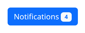
def demo() -> None:
    with bs.scope():
        bs.button(
            [
                "Notifications",
                bs.badge("4", color="light", text_color="primary").classes("ms-1"),
            ],
            color="primary",
        )
badge is the snake_case alias for Badge.
Badge sizing
Badges scale to match the size of their parent through relative font sizing.
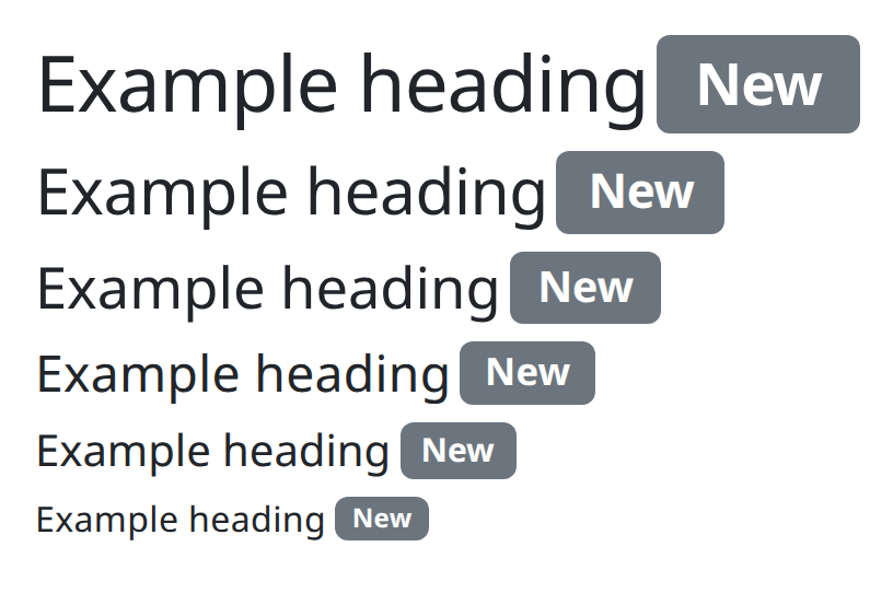
def demo() -> None:
    with bs.scope():
        for level in range(1, 7):
            with ui.element(f"h{level}").classes("d-flex align-items-center"):
                ui.label("Example heading")
                bs.badge("New", color="secondary").classes("ms-1")
Background colors
Use the color argument for one of Bootstrap's contextual color classes.

def demo() -> None:
    with bs.scope():
        bs.badge("Primary", color="primary").classes("me-1")
        bs.badge("Secondary", color="secondary").classes("me-1")
        bs.badge("Success", color="success").classes("me-1")
        bs.badge("Warning", color="warning").classes("me-1")
        bs.badge("Danger", color="danger").classes("me-1")
        bs.badge("Info", color="info").classes("me-1")
        bs.badge("Light", text_color="dark", color="light").classes("me-1")
        bs.badge("Dark", color="dark")
Text colors
text_color overrides the foreground token when the background would otherwise
hide the label.

def demo() -> None:
    with bs.scope():
        bs.badge("Primary", text_color="primary").classes("me-1")
        bs.badge("Secondary", text_color="secondary").classes("me-1")
        bs.badge("Success", text_color="success").classes("me-1")
        bs.badge("Warning", text_color="warning").classes("me-1")
        bs.badge("Danger", text_color="danger").classes("me-1")
        bs.badge("Info", text_color="info").classes("me-1")
        bs.badge("Light", text_color="light", color="dark").classes("me-1")
        bs.badge("Dark", text_color="dark")
Pill badges
Set pill=True for the fully rounded chip.

def demo() -> None:
    with bs.scope():
        bs.badge("Primary", color="primary", pill=True).classes("me-1")
        bs.badge("Secondary", color="secondary", pill=True).classes("me-1")
        bs.badge("Success", color="success", pill=True).classes("me-1")
        bs.badge("Warning", color="warning", pill=True).classes("me-1")
        bs.badge("Danger", color="danger", pill=True).classes("me-1")
        bs.badge("Info", color="info", pill=True).classes("me-1")
        bs.badge("Light", text_color="dark", color="light", pill=True).classes("me-1")
        bs.badge("Dark", color="dark", pill=True)
Positioning
Use Bootstrap's position utility classes to put a badge in the corner of a link or button.
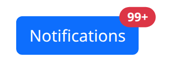
def demo() -> None:
    with bs.scope():
        bs.button(
            [
                "Notifications",
                bs.badge(
                    "99+",
                    color="danger",
                    pill=True,
                    text_color="white",
                    class_name="position-absolute top-0 start-100 translate-middle",
                ),
            ],
            color="primary",
            class_name="position-relative",
        )
Links
Add href to create actionable badges with hover and focus states. Bootstrap 5
underlines links by default; text-decoration-none overrides that.

def demo() -> None:
    with bs.scope():
        bs.badge("Primary", href="#", color="primary").classes("me-1 text-decoration-none")
        bs.badge("Secondary", href="#", color="secondary").classes("me-1 text-decoration-none")
        bs.badge("Success", href="#", color="success").classes("me-1 text-decoration-none")
        bs.badge("Warning", href="#", color="warning").classes("me-1 text-decoration-none")
        bs.badge("Danger", href="#", color="danger").classes("me-1 text-decoration-none")
        bs.badge("Info", href="#", color="info").classes("me-1 text-decoration-none")
        bs.badge("Light", href="#", text_color="dark", color="light").classes(
            "me-1 text-decoration-none"
        )
        bs.badge("Dark", href="#", color="dark").classes("text-decoration-none")
Argument reference
| Property | Type | Default | DBC 2.0.4 name | Support (native) | Support (compat) |
|---|---|---|---|---|---|
| children | a list of or a singular dash component, string or number | None | children | supported | supported |
| id | string | None | id | supported | supported |
| color | string | 'secondary' | color | supported | supported |
| text_color | string | None | text_color | supported | supported |
| n_clicks | number | 0 | n_clicks | adapted | adapted |
| href | string | None | href | supported | supported |
| external_link | boolean | None | external_link | supported | supported |
| pill | boolean | None | pill | supported | supported |
| style | unknown | None | style | supported | supported |
| class_name | string | None | className | supported | supported |
| tag | string | None | tag | supported | supported |
| target | string | None | target | supported | supported |
| title | string | None | title | supported | supported |
| key | string | None | key | unsupported | unsupported |
| class_name | string | None | className | supported | supported |
Notes
Badges are phrasing content: pass a short string, not a nested layout. Pair a
badge with a heading or a nav label rather than using it as a standalone button
unless you also pass href or on_click. Shared props class_name, style,
and id work as elsewhere in the library.