Modal
Modal is Bootstrap 5's dialog overlay: a titled panel that sits above the
page for confirmation, short forms, or detail the user did not ask to navigate
away for. The family is Modal, ModalHeader, ModalTitle, ModalBody, and
ModalFooter. The dialog is rendered through an overlay portal so z-index and
positioning stay above the rest of the layout.
Basic usage
Build the sections in order: header (with title), body, footer. Keep the default backdrop and keyboard behavior unless you have a reason to lock the dialog.
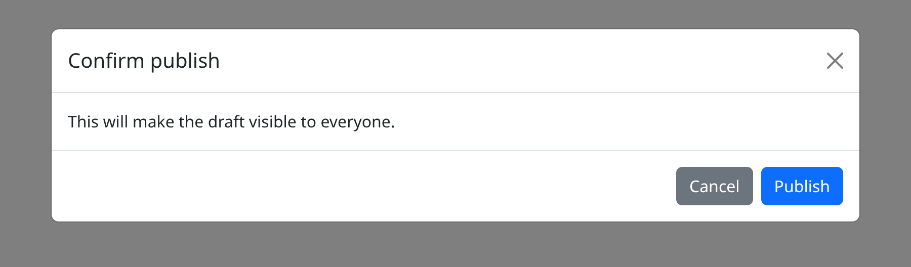
def demo() -> None:
    with bs.scope(), bs.modal(size="lg", is_open=True):
        with bs.modal_header():
            bs.modal_title("Confirm publish")
        with bs.modal_body():
            ui.label("This will make the draft visible to everyone.")
        with bs.modal_footer():
            bs.button("Cancel", color="secondary")
            bs.button("Publish")
Live example
The snippet below is exactly what the demo service runs. The highlighted
demo() function is the same source the demo executes, not a rewritten copy.
def demo() -> None:
    with bs.scope():
        modal = bs.modal(is_open=False, backdrop="static")
        with modal:
            ui.label("Clicking the backdrop does not close this modal.")

            def close_modal() -> None:
                modal.set_value(False)

            bs.button("Close", on_click=close_modal)

        def open_modal() -> None:
            modal.set_value(True)

        bs.button("Open modal", on_click=open_modal)
Options
size
size is the Bootstrap dialog width token. Use "sm" for short confirms,
omit it for the default, "lg" for a small form, and "xl" when the body
holds a table or a two-column layout. Size does not change header or footer
structure.
backdrop
backdrop=False removes the dimmed layer behind the dialog. The overlay
portal still hosts the modal, but the page is not shaded. A static backdrop
(the Bootstrap static value) keeps the shade and ignores clicks on it, so
the user cannot dismiss by clicking outside. Pair a static backdrop with an
explicit close button in the header or footer.
keyboard and Escape
keyboard controls whether the Escape key dismisses the dialog. With a static
backdrop, Escape still closes the modal when keyboard is true; set
keyboard to false when the user must choose an on-dialog action (for
example a blocking confirm). backdrop=False does not by itself disable
Escape — that is keyboard.
Family roles
Modalis the overlay host. It ownsbackdrop,keyboard, andsize.ModalHeaderis the top bar; putModalTitleinside it, not beside it.ModalTitleis the accessible name of the dialog.ModalBodyis the scrollable content slot.ModalFooterholds dismissing and confirming actions.
Do not skip the title if the body is a form: screen readers use it as the dialog name. The portal keeps the markup out of local stacking contexts, which is why a modal inside a transformed card still covers the page.
Notes
Footer buttons use NiceGUI on_click callables. There is no modal-level
n_clicks; count or handle clicks on the Button components you place in the
header and footer.
Argument reference
| Property | Type | Default | DBC 2.0.4 name | Support (native) | Support (compat) |
|---|---|---|---|---|---|
| children | a list of or a singular dash component, string or number | None | children | supported | supported |
| id | string | None | id | supported | supported |
| is_open | boolean | None | isOpen | supported | supported |
| centered | boolean | None | centered | supported | supported |
| scrollable | boolean | None | scrollable | supported | supported |
| size | string | None | size | supported | supported |
| backdrop | boolean | a value equal to: 'static' | None | backdrop | supported | supported |
| fullscreen | boolean | a value equal to: 'sm-down', 'md-down', 'lg-down', 'xl-down', 'xxl-down' | None | fullscreen | supported | supported |
| keyboard | boolean | None | keyboard | supported | supported |
| fade | boolean | None | fade | supported | supported |
| style | unknown | None | style | supported | supported |
| dialog_style | dict | None | dialog_style | supported | supported |
| content_style | dict | None | content_style | supported | supported |
| backdrop_style | dict | None | backdrop_style | supported | supported |
| class_name | string | None | className | supported | supported |
| dialog_class_name | string | None | dialog_class_name | supported | supported |
| backdrop_class_name | string | None | backdrop_class_name | supported | supported |
| content_class_name | string | None | content_class_name | supported | supported |
| tag | string | None | tag | supported | supported |
| autofocus | boolean | None | autofocus | supported | supported |
| enforceFocus | boolean | None | enforceFocus | supported | supported |
| role | string | None | role | supported | supported |
| labelledby | string | None | labelledby | supported | supported |
| zindex | number | string | None | zindex | supported | supported |
| dialogStyle | dict | None | dialogStyle | supported | supported |
| contentStyle | dict | None | contentStyle | supported | supported |
| backdropStyle | dict | None | backdropStyle | supported | supported |
| class_name | string | None | className | supported | supported |
| backdropClassName | string | None | backdropClassName | supported | supported |
| contentClassName | string | None | contentClassName | supported | supported |
| dialogClassName | string | None | dialogClassName | supported | supported |
| autoFocus | boolean | None | autoFocus | supported | supported |
| labelledBy | string | None | labelledBy | supported | supported |
| zIndex | number | string | None | zIndex | supported | supported |