Card
Card is a bordered content container for a heading, media, body, and optional
footer. It maps to Bootstrap 5's card family (card-header, card-body,
card-img-top, card-footer, card-group). Use it for dashboards, product
tiles, and any repeatable unit that should share a common chrome.
Basic usage
A card with body=True wraps its children in a card-body for you. For
anything beyond a single text block, compose the named regions instead.
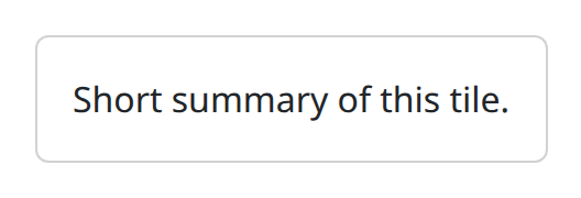
card is the snake_case alias for Card. body defaults to False.
Composition
Build a realistic card from CardHeader, CardImg, CardBody, and
CardFooter. Wrap sibling cards in CardGroup so they share equal height and
joined borders. CardImg takes src and alt; top=True places the image
above the body (bottom=True places it below).
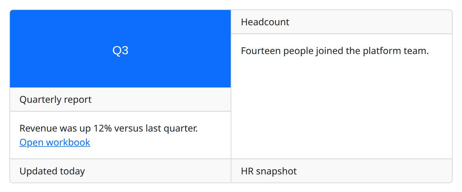
def demo() -> None:
    with bs.scope(), bs.card_group():
        with bs.card():
            bs.card_img(
                src="data:image/svg+xml,%3Csvg xmlns='http://www.w3.org/2000/svg' width='400' height='140'%3E%3Crect width='400' height='140' fill='%230d6efd'/%3E%3Ctext x='200' y='80' text-anchor='middle' fill='%23fff' font-family='sans-serif' font-size='22'%3EQ3%3C/text%3E%3C/svg%3E",
                alt="Q3 revenue chart",
                top=True,
            )
            bs.card_header("Quarterly report")
            with bs.card_body():
                ui.label("Revenue was up 12% versus last quarter.")
                bs.card_link("Open workbook", href="/reports/q3")
            bs.card_footer("Updated today")
        with bs.card():
            bs.card_header("Headcount")
            with bs.card_body():
                ui.label("Fourteen people joined the platform team.")
            bs.card_footer("HR snapshot")
CardImgOverlay layers copy on top of an image when you need a caption over
media. overlay=True on CardImg is the image-side flag for that layout.
CardLink is a link styled for use inside the body; it supports href,
external_link, on_click, and n_clicks.
Colored and outline cards
color applies a contextual background. outline=True keeps a colored border
and a lighter fill. inverse=True switches the inner text to a light tone for
dark backgrounds.
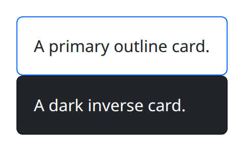
def demo() -> None:
    with bs.scope():
        bs.card("A primary outline card.", body=True, color="primary", outline=True)
        bs.card("A dark inverse card.", body=True, color="dark", inverse=True)
Argument reference
| Property | Type | Default | DBC 2.0.4 name | Support (native) | Support (compat) |
|---|---|---|---|---|---|
| children | a list of or a singular dash component, string or number | None | children | supported | supported |
| id | string | None | id | supported | supported |
| color | string | None | color | supported | supported |
| body | boolean | None | body | supported | supported |
| outline | boolean | None | outline | supported | supported |
| inverse | boolean | None | inverse | supported | supported |
| style | unknown | None | style | supported | supported |
| class_name | string | None | className | supported | supported |
| key | string | None | key | unsupported | unsupported |
| class_name | string | None | className | supported | supported |
Notes
Do not put raw strings directly in a grouping card unless body=True (or a
CardBody) is there to hold them. Prefer the named subcomponents for anything
you will restyle later. See the compatibility page for how Dash click counters
on CardLink are adapted to NiceGUI.