Accordion
Accordion stacks collapsible panels so related copy stays compact until the reader
opens a header. It is the NiceGUI surface for Bootstrap 5's accordion
(accordion / accordion-item). Use it for FAQs, settings groups, and any long
page where several sections should share one vertical footprint.
Basic usage
Nest AccordionItem children inside Accordion. Pass title for the clickable
header and put the panel body in the item (a with-block or child elements). Set
item_id when you need to address a panel from Python. The snippets below are
the same sources the demo service runs.
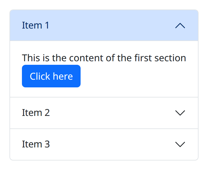
def demo() -> None:
    with bs.scope(), bs.accordion():
        with bs.accordion_item(title="Item 1"):
            ui.label("This is the content of the first section")
            bs.button("Click here")
        with bs.accordion_item(title="Item 2"):
            ui.label("This is the content of the second section")
            bs.button("Don't click me!", color="danger")
        with bs.accordion_item(title="Item 3"):
            ui.label("This is the content of the third section")
The snake_case names accordion and accordion_item are aliases for Accordion
and AccordionItem.
Start collapsed
Pass start_collapsed=True to close every panel on first render. Without it the
first item is open by default.
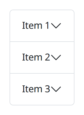
def demo() -> None:
    with bs.scope(), bs.accordion(start_collapsed=True):
        with bs.accordion_item(title="Item 1"):
            ui.label("This is the content of the first section")
        with bs.accordion_item(title="Item 2"):
            ui.label("This is the content of the second section")
        with bs.accordion_item(title="Item 3"):
            ui.label("This is the content of the third section")
Flush
flush=True drops the outer border and radius so the stack can sit flush
against a parent edge.
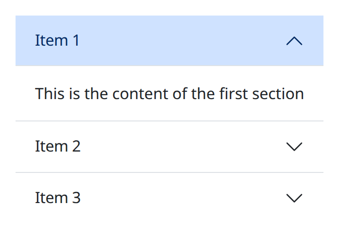
def demo() -> None:
    with bs.scope(), bs.accordion(flush=True):
        with bs.accordion_item(title="Item 1"):
            ui.label("This is the content of the first section")
        with bs.accordion_item(title="Item 2"):
            ui.label("This is the content of the second section")
        with bs.accordion_item(title="Item 3"):
            ui.label("This is the content of the third section")
Callbacks
Each item can be assigned a stable item_id, which the active_item value and
on_change use to say which panel is open. Items without an explicit id are
labelled item-0, item-1, and so on.
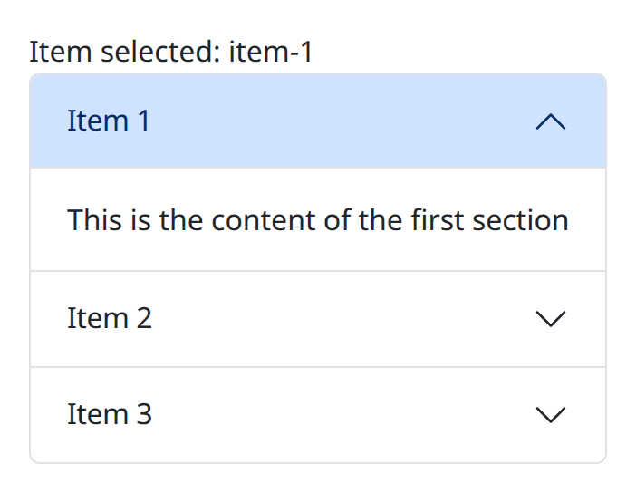
def demo() -> None:
    with bs.scope():
        selected = ui.label("Item selected: item-1")

        def on_change(event: object) -> None:
            value = getattr(event, "value", event)
            selected.set_text(f"Item selected: {value}")

        with bs.accordion(active_item="item-1", on_change=on_change):
            with bs.accordion_item(title="Item 1", item_id="item-1"):
                ui.label("This is the content of the first section")
            with bs.accordion_item(title="Item 2", item_id="item-2"):
                ui.label("This is the content of the second section")
            with bs.accordion_item(title="Item 3", item_id="item-3"):
                ui.label("This is the content of the third section")
Always open
Set always_open=True to allow several panels to stay open together.
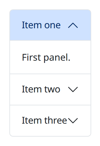
def demo() -> None:
    with bs.scope(), bs.accordion(always_open=True):
        with bs.accordion_item(title="Item one"):
            ui.label("First panel.")
        with bs.accordion_item(title="Item two"):
            ui.label("Second panel.")
        with bs.accordion_item(title="Item three"):
            ui.label("Third panel.")
With always_open=True, active_item is a list of ids.
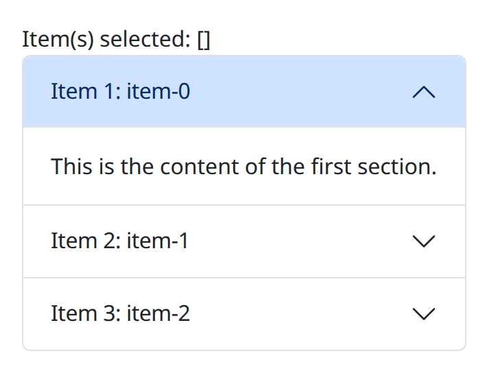
def demo() -> None:
    with bs.scope():
        selected = ui.label("Item(s) selected: []")

        def on_change(event: object) -> None:
            value = getattr(event, "value", event)
            selected.set_text(f"Item(s) selected: {value}")

        with bs.accordion(always_open=True, on_change=on_change):
            with bs.accordion_item(title="Item 1: item-0"):
                ui.label("This is the content of the first section.")
            with bs.accordion_item(title="Item 2: item-1"):
                ui.label("This is the content of the second section.")
            with bs.accordion_item(title="Item 3: item-2"):
                ui.label("This is the content of the third section.")
Argument reference
| Property | Type | Default | DBC 2.0.4 name | Support (native) | Support (compat) |
|---|---|---|---|---|---|
| children | a list of or a singular dash component, string or number | None | children | supported | supported |
| id | string | None | id | supported | supported |
| active_item | string | list of strings | None | active_item | supported | supported |
| always_open | boolean | False | always_open | supported | supported |
| start_collapsed | boolean | False | start_collapsed | supported | supported |
| flush | boolean | None | flush | supported | supported |
| style | unknown | None | style | supported | supported |
| class_name | string | None | className | supported | supported |
| persistence | boolean | string | number | None | persistence | unsupported | unsupported |
| persisted_props | list of a value equal to: 'active_item's | None | persisted_props | unsupported | unsupported |
| persistence_type | a value equal to: 'local', 'session', 'memory' | None | persistence_type | unsupported | unsupported |
| key | string | None | key | unsupported | unsupported |
| class_name | string | None | className | supported | supported |
Notes
AccordionItem also accepts title_class_name for the header control, plus the
shared layout props class_name, style, and id. persist defaults to
"off". Give each item a stable item_id if you drive active_item from
Python. Header click counts from Dash are not a separate accordion prop here;
interactive wiring follows NiceGUI handlers. See the compatibility page for how
Dash-style props are adapted.