Table
Table renders Bootstrap 5 table markup for tabular data. It is the right host for rows and columns that need scanability: striped rows, borders, hover highlighting, and an optional responsive wrapper that scrolls on narrow viewports.
Use Table when the data is inherently grid-shaped. Do not force a table on a definition list or a card grid just to get stripes.
Basic usage
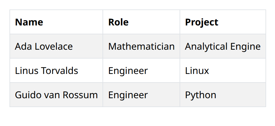
def demo() -> None:
    with bs.scope(), bs.table(striped=True, bordered=True, hover=True, responsive=True):
        with ui.element("thead"), ui.element("tr"):
            ui.html("Name", tag="th")
            ui.html("Role", tag="th")
            ui.html("Project", tag="th")
        with ui.element("tbody"):
            for name, role, project in (
                ("Ada Lovelace", "Mathematician", "Analytical Engine"),
                ("Linus Torvalds", "Engineer", "Linux"),
                ("Guido van Rossum", "Engineer", "Python"),
            ):
                with ui.element("tr"):
                    ui.html(name, tag="td")
                    ui.html(role, tag="td")
                    ui.html(project, tag="td")
Fill the table with the row content your application already has, or build it from
a pandas DataFrame with from_dataframe as shown below. The visual flags below
compose independently.
Options
Striped, bordered, hover
striped alternates row backgrounds so wide grids are easier to track. bordered
draws cell borders, which helps when columns are dense or numeric. hover
highlights the row under the pointer so selection and scan paths are obvious.
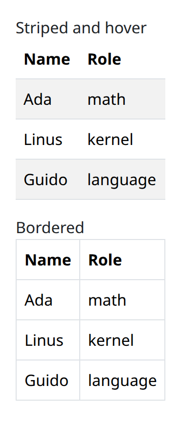
def demo() -> None:
    def sample_table(**props) -> None:
        with bs.table(**props):
            with ui.element("thead"), ui.element("tr"):
                ui.html("Name", tag="th")
                ui.html("Role", tag="th")
            with ui.element("tbody"):
                for name, role in (
                    ("Ada", "math"),
                    ("Linus", "kernel"),
                    ("Guido", "language"),
                ):
                    with ui.element("tr"):
                        ui.html(name, tag="td")
                        ui.html(role, tag="td")

    with bs.scope():
        ui.label("Striped and hover")
        sample_table(striped=True, hover=True)
        ui.label("Bordered")
        sample_table(bordered=True, hover=False, striped=False)
Turn on only what the data needs. Stripes plus borders plus hover on a small two- column table is heavier than the content.
Responsive
responsive wraps the table so horizontal overflow scrolls inside the wrapper
instead of stretching the page. Enable it whenever the column count can exceed a
phone width. Pair it with hover so the row highlight still tracks while the user
scrolls sideways.
Building from a DataFrame
Table.from_dataframe builds header and body rows from a pandas DataFrame. Pandas
is an optional dependency; install the examples extra before you call it:
pip install nicegui-bootstrap-components[examples]
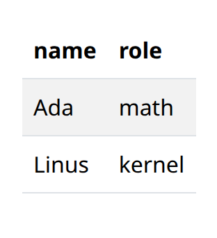
def demo() -> None:
    with bs.scope():
        try:
            import pandas as pd
        except ImportError:
            ui.label(
                "Install the examples extra to render this table: "
                "pip install nicegui-bootstrap-components[examples]"
            )
            return
        df = pd.DataFrame(
            {
                "name": ["Ada", "Linus"],
                "role": ["math", "kernel"],
            }
        )
        bs.Table.from_dataframe(
            df,
            index=False,
            striped=True,
            bordered=False,
            hover=True,
            responsive=True,
        )
The DataFrame columns become the header labels, in order. Clean the frame (column names, dtypes, row order) before you pass it in; the helper does not try to guess a presentation layer on top of pandas.
from_dataframe still accepts the same visual flags as the constructor, so a
DataFrame-backed table can be striped, bordered, hoverable, and responsive without
a second wrapper.
Argument reference
| Property | Type | Default | DBC 2.0.4 name | Support (native) | Support (compat) |
|---|---|---|---|---|---|
| children | a list of or a singular dash component, string or number | None | children | supported | supported |
| id | string | None | id | supported | supported |
| style | unknown | None | style | supported | supported |
| class_name | string | None | className | supported | supported |
| size | string | None | size | supported | supported |
| bordered | boolean | None | bordered | supported | supported |
| borderless | boolean | None | borderless | supported | supported |
| striped | boolean | None | striped | supported | supported |
| color | string | None | color | supported | supported |
| hover | boolean | None | hover | supported | supported |
| responsive | boolean | string | None | responsive | supported | supported |
| key | string | None | key | unsupported | unsupported |
| class_name | string | None | className | supported | supported |