Button Group
Button group packs several buttons into one segmented control so related actions
read as a single tool. It is Bootstrap 5's btn-group / btn-group-vertical.
Use it for view switchers, zoom controls, and short exclusive or related
commands that should share a border.
Basic usage
Nest Button children inside ButtonGroup. The group does not take a color of
its own — each child button still sets color, outline, and disabled.
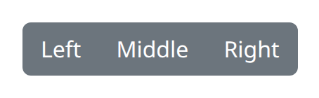
def demo() -> None:
    with bs.scope(), bs.button_group():
        bs.button("Left", color="secondary")
        bs.button("Middle", color="secondary")
        bs.button("Right", color="secondary")
button_group is the snake_case alias for ButtonGroup. Only element children
belong here; wrap labels in a Button rather than passing a raw string.
Size and vertical
size sizes every button in the group ("sm", "lg", or None for default).
vertical=True stacks the buttons instead of placing them in a row (btn-group
becomes btn-group-vertical).
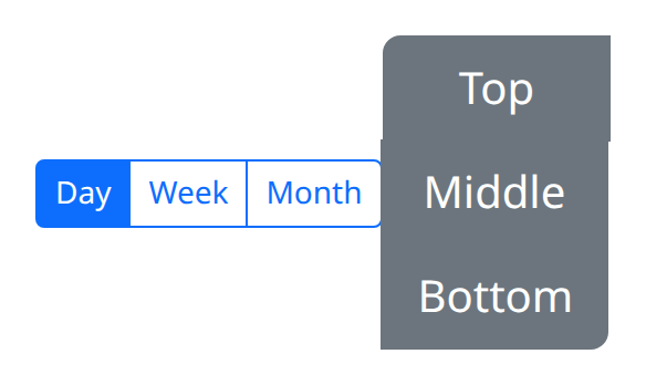
def demo() -> None:
    with bs.scope():
        with bs.button_group(size="sm"):
            bs.button("Day", color="primary")
            bs.button("Week", color="primary", outline=True)
            bs.button("Month", color="primary", outline=True)

        with bs.button_group(size="lg", vertical=True):
            bs.button("Top", color="secondary")
            bs.button("Middle", color="secondary")
            bs.button("Bottom", color="secondary")
Keep the group to a handful of short labels. For one action plus overflow, a
DropdownMenu with group=True sits more naturally next to a sibling button
than a long horizontal group.
Argument reference
| Property | Type | Default | DBC 2.0.4 name | Support (native) | Support (compat) |
|---|---|---|---|---|---|
| children | a list of or a singular dash component, string or number | None | children | supported | supported |
| id | string | None | id | supported | supported |
| size | string | None | size | supported | supported |
| vertical | boolean | None | vertical | supported | supported |
| style | unknown | None | style | supported | supported |
| class_name | string | None | className | supported | supported |
| key | string | None | key | unsupported | unsupported |
| class_name | string | None | className | supported | supported |
Notes
Disabled and active states stay on the individual Button children. Shared
layout props class_name, style, and id apply to the group wrapper. There
is no Dash click counter on the group itself; handle clicks on each button.
See the compatibility page for native versus dbc naming.