Navbar
Navbar is Bootstrap 5's site header: brand on one side, collapsible links on
the other, optional fixed or sticky positioning. The family is Navbar,
NavbarBrand, NavbarToggler, and NavbarSimple. Use NavbarSimple when
you want brand plus collapse without assembling the pieces; use the parts when
you need custom inner layout.
Basic usage
NavbarSimple takes a brand, optional brand_href, and link children. Set
expand to a breakpoint so the toggler appears below that width.
from nicegui import ui
from nicegui_bootstrap_components import bs

with bs.scope():
    with bs.navbar_simple(
        brand="Demo",
        brand_href="/",
        color="dark",
        dark=True,
        expand="lg",
    ):
        bs.nav_link("Home", href="/", active=True)
        bs.nav_link("Docs", href="/docs")
Live example
The snippet below is exactly what the demo service runs. The highlighted
demo() function is the same source the demo executes, not a rewritten copy.
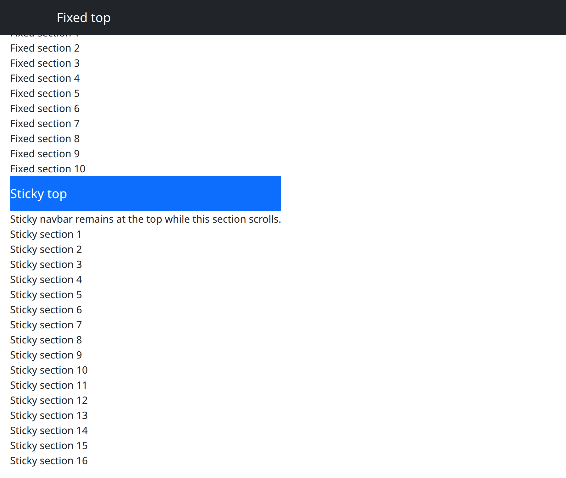
def demo() -> None:
    with bs.scope():
        bs.navbar_simple(brand="Fixed top", color="dark", dark=True, fixed="top")
        with bs.container():
            ui.label("Fixed navbar sits at the viewport top.")
            for index in range(10):
                ui.label(f"Fixed section {index + 1}")
        bs.navbar_simple(brand="Sticky top", color="primary", dark=True, sticky="top")
        with bs.container():
            ui.label("Sticky navbar remains at the top while this section scrolls.")
            for index in range(16):
                ui.label(f"Sticky section {index + 1}")
Options
expand, fixed, and sticky
On both Navbar and NavbarSimple:
expandisTrue(always expanded),False(always collapsed to the toggler), or a breakpoint string such as"sm","md","lg","xl".NavbarSimpledefaults toTrue.fixedis"top"or"bottom"and takes the bar out of flow.stickyis"top"and keeps the bar in flow until it pins.
Do not set fixed and sticky together. When the bar is fixed, add top
padding on the page content so the first heading is not hidden underneath.
Navbar, NavbarBrand, NavbarToggler
Assemble the chrome yourself when the simple helper is too opinionated.
Navbar accepts color, dark, expand, fixed, sticky, plus tag
(default "nav") and role. NavbarBrand is the name or logo; href and
external_link control the destination. NavbarToggler points target at
the collapsible region (pass the component when you have it). The toggler is a
button (type="button" by default) with on_click and n_clicks.
from nicegui import ui
from nicegui_bootstrap_components import bs

with bs.scope():
    with bs.navbar(color="light", expand="md", sticky="top"):
        bs.navbar_brand("Demo", href="/")
        bs.navbar_toggler()
NavbarSimple extras
NavbarSimple also accepts brand_external_link, brand_style, fluid for
a full-width inner container, links_left to put the links before remaining
content, and is_open for the collapse state. dark pairs with a dark
color so brand and toggler contrast correctly.
Notes
NavbarToggler exposes n_clicks and on_click. The NiceGUI-facing API is
the callable; treat the counter as adapted DBC state rather than something to
poll. Link navigation still goes through href on NavbarBrand and
NavLink.
Argument reference
| Property | Type | Default | DBC 2.0.4 name | Support (native) | Support (compat) |
|---|---|---|---|---|---|
| children | a list of or a singular dash component, string or number | None | children | supported | supported |
| id | string | None | id | supported | supported |
| dark | boolean | True | dark | supported | supported |
| fixed | string | None | fixed | supported | supported |
| sticky | a value equal to: 'top' | None | sticky | supported | supported |
| color | string | 'primary' | color | supported | supported |
| expand | boolean | string | 'md' | expand | supported | supported |
| style | unknown | None | style | supported | supported |
| class_name | string | None | className | supported | supported |
| role | string | None | role | supported | supported |
| tag | string | None | tag | supported | supported |
| key | string | None | key | unsupported | unsupported |
| class_name | string | None | className | supported | supported |