Layout
Layout components map onto Bootstrap 5's grid and stack helpers: Container,
Row, Col, and Stack. Use them to place content on a twelve-column grid
that responds at the usual breakpoints, or to stack children without dropping
into raw utility classes.
Container centers and horizontally pads a section of the page. Row wraps
columns so they share a horizontal line. Col is a single grid cell, and
Stack arranges a bundle of children along one axis.
For the grid to work, keep to two rules: put Row and Col inside a
Container (or use Stack for non-grid bundles), and make Col the immediate
child of Row. Content goes inside the Col. The snippets below are the same
sources the demo service runs.
Basic usage
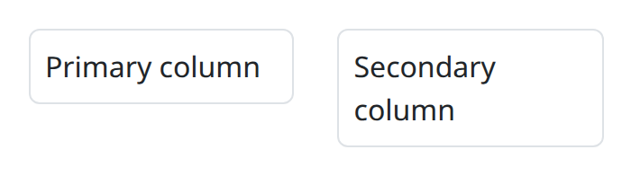
A Container holds a Row of Col children. width is the extra-small width;
md (and friends, when you add them) override from that breakpoint up. The example below is half-and-half from md and full width on smaller viewports.
def demo() -> None:
    with bs.scope(), bs.container(), bs.row():
        with bs.col(width=12, md=6):
            ui.label("Primary column").classes("border rounded p-2")
        with bs.col(width=12, md=6):
            ui.label("Secondary column").classes("border rounded p-2")
Row with columns
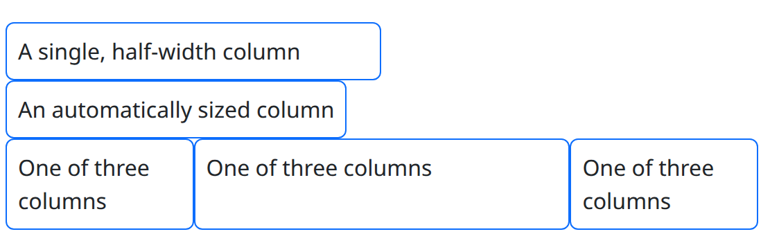
By default columns share the available width equally. Give a column an explicit width to change that. The accepted width values are:
True(the default): the column expands to fill the available space."auto": the column takes the natural width of its content.- An integer
1–12: the column spans that many of the twelve grid columns. Usewidth=6for half,width=4for a third, and so on.
def demo() -> None:
    cell_class = "border border-primary rounded p-2"
    with bs.scope(), bs.container():
        with bs.row(), bs.col(width=6, class_name=cell_class):
            ui.label("A single, half-width column")
        with bs.row(), bs.col(width="auto", class_name=cell_class):
            ui.label("An automatically sized column")
        with bs.row():
            with bs.col(width=3, class_name=cell_class):
                ui.label("One of three columns")
            with bs.col(class_name=cell_class):
                ui.label("One of three columns")
            with bs.col(width=3, class_name=cell_class):
                ui.label("One of three columns")
Specify order and offset
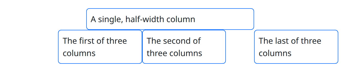
The width argument also accepts a dictionary with size, order, and
offset keys.
sizetakes the same values as the plain width argument.orderreorders columns. It accepts integers or the strings"first"and"last". Columns sort numerically, with"first"and"last"at the extremes. Equal orders keep their source order.offsetincreases the column's left margin by that many grid columns.
def demo() -> None:
    cell_class = "border border-primary rounded p-2"
    with bs.scope(), bs.container():
        with bs.row(), bs.col(width={"size": 6, "offset": 3}, class_name=cell_class):
            ui.label("A single, half-width column")
        with bs.row():
            with bs.col(width={"size": 3, "order": "last", "offset": 1}, class_name=cell_class):
                ui.label("The last of three columns")
            with bs.col(width={"size": 3, "order": 1, "offset": 2}, class_name=cell_class):
                ui.label("The first of three columns")
            with bs.col(width={"size": 3, "order": 5}, class_name=cell_class):
                ui.label("The second of three columns")
Specify width for different screen sizes
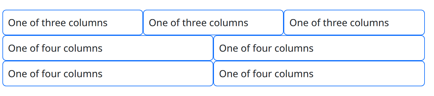
Bootstrap's grid has six responsive tiers. Use the xs, sm, md, lg,
xl, and xxl keyword arguments to set the size, order, and offset of a
column for a screen size and up. Each takes the same values as width.
width is shorthand for xs; if both are set, xs wins.
def demo() -> None:
    cell_class = "border border-primary rounded p-2"
    with bs.scope(), bs.container():
        with bs.row():
            with bs.col(md=4, class_name=cell_class):
                ui.label("One of three columns")
            with bs.col(md=4, class_name=cell_class):
                ui.label("One of three columns")
            with bs.col(md=4, class_name=cell_class):
                ui.label("One of three columns")
        with bs.row():
            with bs.col(width=6, lg=3, class_name=cell_class):
                ui.label("One of four columns")
            with bs.col(width=6, lg=3, class_name=cell_class):
                ui.label("One of four columns")
            with bs.col(width=6, lg=3, class_name=cell_class):
                ui.label("One of four columns")
            with bs.col(width=6, lg=3, class_name=cell_class):
                ui.label("One of four columns")
Row without 'gutters'
Rows add horizontal spacing between columns by default. Remove it with g=0,
or adjust a single axis with gx/gy. All three take values 0–5.

def demo() -> None:
    cell_class = "border border-primary rounded p-2"
    with bs.scope(), bs.container(), bs.row(g=0):
        with bs.col(class_name=cell_class):
            ui.label("One of three columns")
        with bs.col(class_name=cell_class):
            ui.label("One of three columns")
        with bs.col(class_name=cell_class):
            ui.label("One of three columns")
Vertical alignment
Control vertical alignment with the align keyword on either Col or its
parent Row. A value on the Col overrules the row. The options are
"start", "center", and "end".
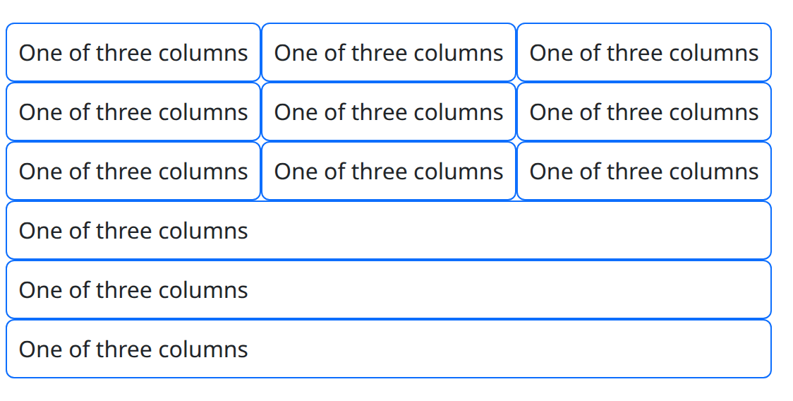
def demo() -> None:
    cell_class = "border border-primary rounded p-2"
    with bs.scope(), bs.container():
        for align in ("start", "center", "end"):
            with bs.row(align=align):
                with bs.col(class_name=cell_class):
                    ui.label("One of three columns")
                with bs.col(class_name=cell_class):
                    ui.label("One of three columns")
                with bs.col(class_name=cell_class):
                    ui.label("One of three columns")
        with bs.row():
            with bs.col(align="start", class_name=cell_class):
                ui.label("One of three columns")
            with bs.col(align="center", class_name=cell_class):
                ui.label("One of three columns")
            with bs.col(align="end", class_name=cell_class):
                ui.label("One of three columns")
Horizontal alignment
Control horizontal alignment with the justify keyword on Row. The options
are "start", "center", "end", "between", "around", and "evenly".
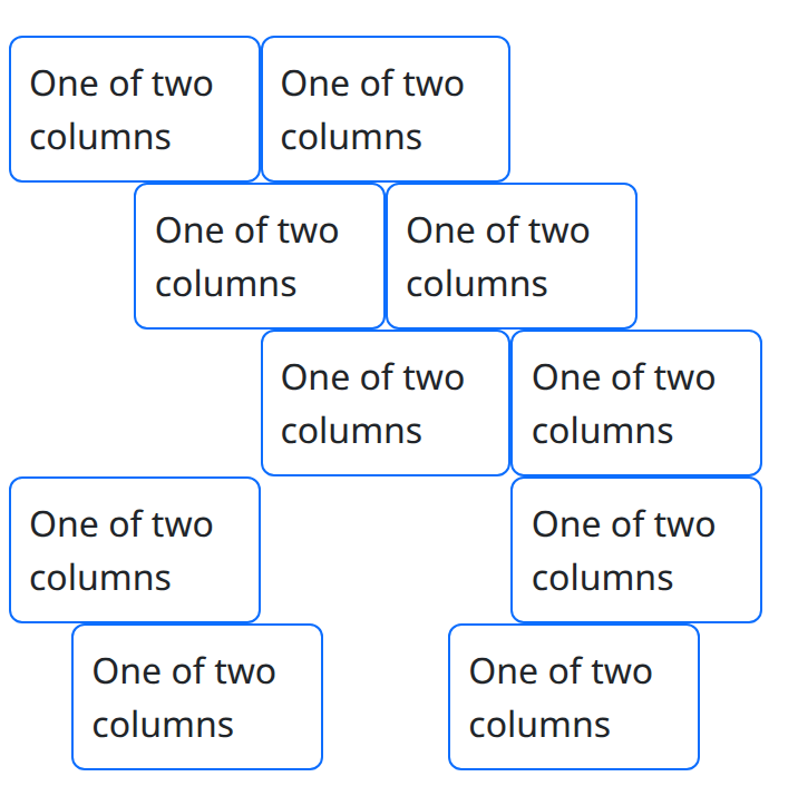
def demo() -> None:
    cell_class = "border border-primary rounded p-2"
    with bs.scope(), bs.container():
        for justify in ("start", "center", "end", "between", "around"):
            with bs.row(justify=justify):
                with bs.col(width=4, class_name=cell_class):
                    ui.label("One of two columns")
                with bs.col(width=4, class_name=cell_class):
                    ui.label("One of two columns")
Using only the grid components
To use the grid without Bootstrap's typography and component CSS, load the grid-only theme once at application startup instead of the full stylesheet:
from nicegui_bootstrap_components import themes
from nicegui_bootstrap_components.assets import StyleMode, setup

setup(mode=StyleMode.UNSCOPED, theme=themes.GRID)
That registers bootstrap-grid.css only. Run
examples/components/layout/grid_only.py as a script to see it: the file's
__main__ block performs this setup, then builds the page. To serve the
file yourself instead, download bootstrap-grid.css and add a link to it
from your page's assets directory.
The snippet and screenshot below are the gallery preview of that page body.
The examples service calls setup(mode=StyleMode.MIXED) once for the whole
process and cannot switch stylesheets per route, so this preview is not a grid-only theme.
The bordered cells are still the real bs.container / bs.row / bs.col
example.
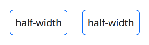
def demo() -> None:
    # Body only — do not call setup here (process-wide, already applied).
    # Standalone grid-only CSS is loaded in ``__main__``; the gallery stays MIXED.
    # Grid-only CSS has no border/padding utilities, and package style props
    # require dicts, so apply a CSS string via NiceGUI .style() on a nested element.
    cell_style = (
        "border: 1px solid #0d6efd; border-radius: 0.375rem; "
        "padding: 0.5rem; width: 100%; box-sizing: border-box;"
    )
    with bs.scope(), bs.container(), bs.row():
        with bs.col(width=6), ui.element().style(cell_style):
            ui.label("half-width")
        with bs.col(width=6), ui.element().style(cell_style):
            ui.label("half-width")
Stacking objects
Stack arranges objects along a vertical (default) or horizontal axis. Set
gap between 0 and 5 to put a consistent gap between the items.
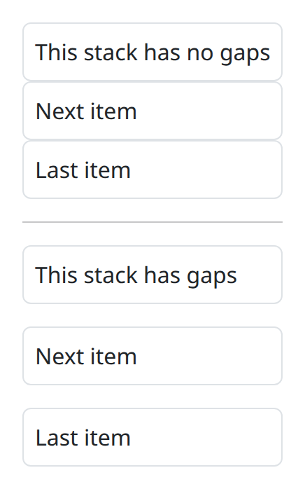
def demo() -> None:
    with bs.scope():
        with bs.stack():
            ui.label("This stack has no gaps").classes("border rounded p-2")
            ui.label("Next item").classes("border rounded p-2")
            ui.label("Last item").classes("border rounded p-2")
        ui.separator()
        with bs.stack(gap=3):
            ui.label("This stack has gaps").classes("border rounded p-2")
            ui.label("Next item").classes("border rounded p-2")
            ui.label("Last item").classes("border rounded p-2")
Use direction="horizontal" for horizontal layouts.
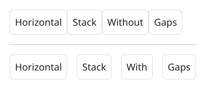
def demo() -> None:
    with bs.scope():
        with bs.stack(direction="horizontal"):
            ui.label("Horizontal").classes("border rounded p-2")
            ui.label("Stack").classes("border rounded p-2")
            ui.label("Without").classes("border rounded p-2")
            ui.label("Gaps").classes("border rounded p-2")
        ui.separator()
        with bs.stack(direction="horizontal", gap=3):
            ui.label("Horizontal").classes("border rounded p-2")
            ui.label("Stack").classes("border rounded p-2")
            ui.label("With").classes("border rounded p-2")
            ui.label("Gaps").classes("border rounded p-2")
Combine stacks with Bootstrap's spacing utilities for finer control. Here the
middle item is pushed away from its neighbours with ms-auto and mx-auto:
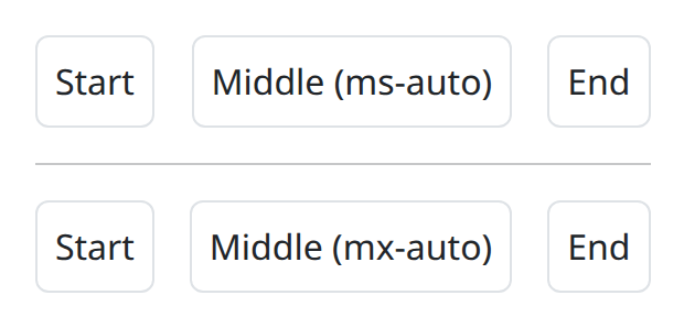
def demo() -> None:
    with bs.scope():
        with bs.stack(direction="horizontal", gap=3):
            ui.label("Start").classes("border rounded p-2")
            ui.label("Middle (ms-auto)").classes("ms-auto border rounded p-2")
            ui.label("End").classes("border rounded p-2")
        ui.separator()
        with bs.stack(direction="horizontal", gap=3):
            ui.label("Start").classes("border rounded p-2")
            ui.label("Middle (mx-auto)").classes("mx-auto border rounded p-2")
            ui.label("End").classes("border rounded p-2")
Notes
These helpers are structural. They have no n_clicks and no value, and cannot
take user input. Put interactive callbacks on the controls you place inside the
cells.
Argument reference
| Property | Type | Default | DBC 2.0.4 name | Support (native) | Support (compat) |
|---|---|---|---|---|---|
| children | a list of or a singular dash component, string or number | None | children | supported | supported |
| id | string | None | id | supported | supported |
| style | unknown | None | style | supported | supported |
| class_name | string | None | className | supported | supported |
| align | a value equal to: 'start', 'center', 'end', 'stretch', 'baseline' | None | align | supported | supported |
| justify | a value equal to: 'start', 'center', 'end', 'around', 'between', 'evenly' | None | justify | supported | supported |
| key | string | None | key | unsupported | unsupported |
| class_name | string | None | className | supported | supported |