Button
Button is the standard action control: submit, cancel, open a dialog, navigate.
It maps to Bootstrap 5's btn (contextual colors, outline variants, size
modifiers). Reach for it whenever the reader must trigger a command; use a link
styled as a button only when the action is navigation.
Basic usage
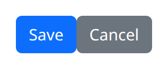
The first argument is the label. color defaults to "primary". Register
on_click in the constructor — listeners are not attached later at class level.
def demo() -> None:
    with bs.scope():
        bs.button("Save", color="primary", on_click=lambda: ui.notify("Saved"))
        bs.button("Cancel", color="secondary")
button is the snake_case alias for Button.
Live example
The snippets below are exactly what the demo service runs. Each highlighted
demo() function is the same source the demo executes, not a rewritten copy.
Colors
def demo() -> None:
    with bs.scope(), bs.row():
        for color in (
            "primary",
            "secondary",
            "success",
            "danger",
            "warning",
            "info",
            "light",
            "dark",
        ):
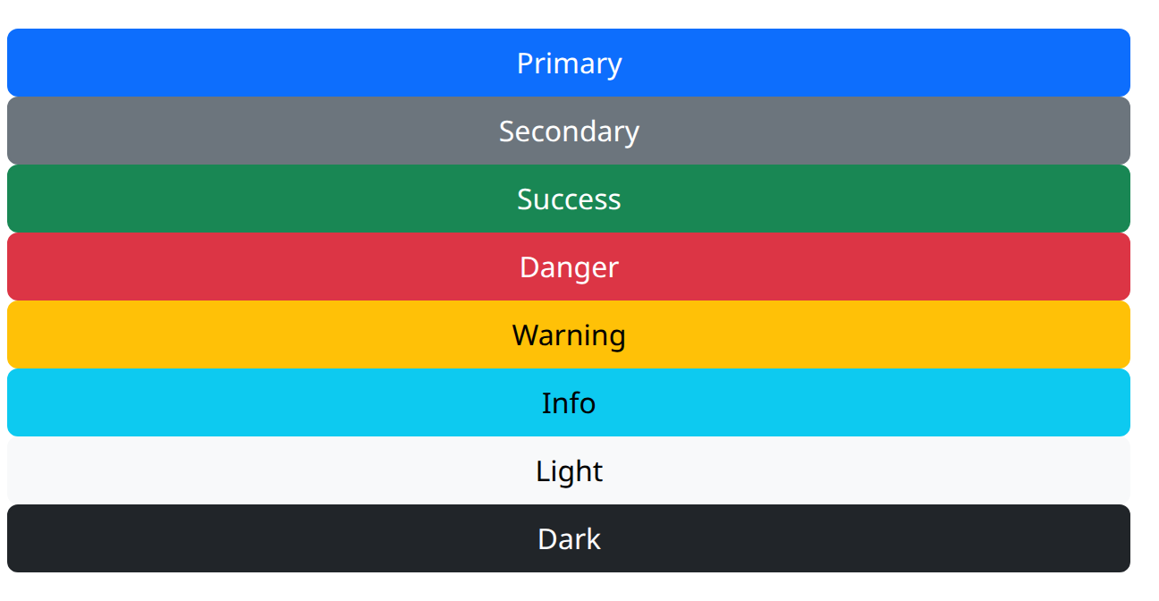
            bs.button(color.capitalize(), color=color)
Outline and sizes
def demo() -> None:
    with bs.scope():
        with bs.row():
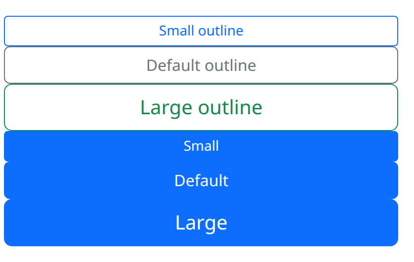
            bs.button("Small outline", color="primary", outline=True, size="sm")
            bs.button("Default outline", color="secondary", outline=True)
            bs.button("Large outline", color="success", outline=True, size="lg")
        with bs.row():
            bs.button("Small", color="primary", size="sm")
            bs.button("Default", color="primary")
            bs.button("Large", color="primary", size="lg")
Outline, size, and state
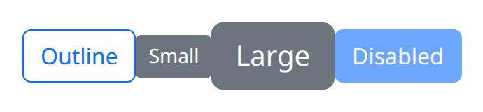
outline=True draws a bordered button instead of a solid fill. size accepts
Bootstrap size tokens such as "sm" and "lg" (None is the default size).
disabled=True blocks presses; active=True applies the pressed appearance
without changing disabled state. type defaults to "button" so a button
inside a form does not submit unless you set type="submit".
def demo() -> None:
    with bs.scope():
        bs.button("Outline", color="primary", outline=True)
        bs.button("Small", color="secondary", size="sm")
        bs.button("Large", color="secondary", size="lg")
        bs.button("Disabled", color="primary", disabled=True)
Link buttons
Pass href to render an anchor that still looks like a button. target,
download, and external_link apply to that link. Leave href unset for a
real <button> that fires on_click. n_clicks starts at 0 and increments
on each press.
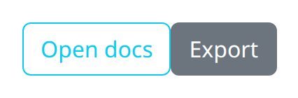
def demo() -> None:
    with bs.scope():
        bs.button("Open docs", color="info", outline=True, href="/docs")
        bs.button(
            "Export",
            color="secondary",
            href="/export.csv",
            download="export.csv",
        )
Argument reference
| Property | Type | Default | DBC 2.0.4 name | Support (native) | Support (compat) |
|---|---|---|---|---|---|
| children | a list of or a singular dash component, string or number | None | children | supported | supported |
| id | string | None | id | supported | supported |
| n_clicks | number | 0 | n_clicks | adapted | adapted |
| color | string | None | color | supported | supported |
| href | string | None | href | supported | supported |
| external_link | boolean | None | external_link | supported | supported |
| class_name | string | None | className | supported | supported |
| style | unknown | None | style | supported | supported |
| active | boolean | None | active | supported | supported |
| disabled | boolean | None | disabled | supported | supported |
| size | string | None | size | supported | supported |
| title | string | None | title | supported | supported |
| outline | boolean | None | outline | supported | supported |
| target | string | None | target | supported | supported |
| type | a value equal to: 'button', 'reset', 'submit' | None | type | supported | supported |
| download | string | None | download | supported | supported |
| name | string | None | name | supported | supported |
| value | string | None | value | supported | supported |
| rel | string | None | rel | supported | supported |
| key | string | None | key | unsupported | unsupported |
| class_name | string | None | className | supported | supported |
Notes
name and value are available when the button participates in a form.
Dash's n_clicks is implemented for NiceGUI rather than copied as a Dash
callback input; prefer on_click in new code. See the compatibility page for
the native versus dbc surfaces. Group related actions with ButtonGroup.