Dropdown Menu
Dropdown menu is a toggle plus a floating list of actions. It maps to Bootstrap
5's dropdown (dropdown-toggle, dropdown-menu, dropdown-item). Use it for
overflow actions, per-row menus, and navbar account menus — not for primary
navigation that should stay visible.
Basic usage
Set label on DropdownMenu for the toggle text, then nest DropdownMenuItem
children. An item can be a regular row, a header (header=True), or a
separator (divider=True). color defaults to "secondary"; caret defaults
to True.
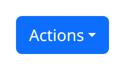
def demo():
    with bs.scope(), bs.dropdown_menu(label="Actions", color="primary"):
        bs.dropdown_menu_item("Edit")
        bs.dropdown_menu_item("Duplicate")
        bs.dropdown_menu_item(divider=True)
        bs.dropdown_menu_item("Delete")
dropdown_menu and dropdown_menu_item are the snake_case aliases for
DropdownMenu and DropdownMenuItem.
Direction and navbar placement
direction defaults to "down". Bootstrap 5 also accepts "up", "start",
and "end" for dropup and sideways menus. Set in_navbar=True when the
control lives inside a navbar so alignment and wrapping match the bar.
align_end=True right-aligns the menu with the toggle. nav=True styles the
toggle as a nav link; group=True sits the toggle in a button group.
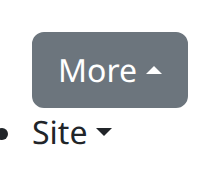
def demo():
    with bs.scope():
        with bs.dropdown_menu(label="More", direction="up", align_end=True):
            bs.dropdown_menu_item("Profile", href="/profile")
            bs.dropdown_menu_item("Settings", href="/settings")
            bs.dropdown_menu_item(header=True, children="Account")
            bs.dropdown_menu_item("Sign out")

        with bs.dropdown_menu(label="Site", in_navbar=True, caret=True):
            bs.dropdown_menu_item("Docs", href="/docs")
            bs.dropdown_menu_item("Blog", href="/blog")
size sizes the toggle ("sm", "lg", or None). disabled=True disables
the toggle. toggle_class_name and toggle_style target the toggle button
rather than the outer wrapper. on_toggle observes open/close. Items accept
href, disabled, active, n_clicks, and toggle (default True, which
closes the menu after a click).
Argument reference
| Property | Type | Default | DBC 2.0.4 name | Support (native) | Support (compat) |
|---|---|---|---|---|---|
| children | a list of or a singular dash component, string or number | None | children | supported | supported |
| id | string | None | id | supported | supported |
| label | a list of or a singular dash component, string or number | None | label | supported | supported |
| color | string | None | color | supported | supported |
| direction | a value equal to: 'down', 'start', 'up', 'end' | None | direction | supported | supported |
| size | a value equal to: 'sm', 'md', 'lg' | None | size | supported | supported |
| disabled | boolean | False | disabled | supported | supported |
| style | unknown | None | style | supported | supported |
| class_name | string | None | className | supported | supported |
| align_end | boolean | None | align_end | supported | supported |
| in_navbar | boolean | None | in_navbar | supported | supported |
| nav | boolean | None | nav | supported | supported |
| caret | boolean | True | caret | supported | supported |
| menu_variant | a value equal to: 'light', 'dark' | 'light' | menu_variant | supported | supported |
| group | boolean | None | group | supported | supported |
| toggle_style | dict | None | toggle_style | supported | supported |
| toggle_class_name | string | None | toggle_class_name | supported | supported |
| key | string | None | key | unsupported | unsupported |
| class_name | string | None | className | supported | supported |
| toggleClassName | string | None | toggleClassName | supported | supported |
Notes
Older dash-bootstrap-components props right and addon_type were removed;
the compat surface rejects them. Prefer align_end and direction instead.
Item click counts follow the same NiceGUI adaptation as other clickable
components — see the compatibility page. Keep headers and dividers as their
own DropdownMenuItem children rather than encoding them in the parent.