Jumbotron
Jumbotron is not a component in this library. Bootstrap 5 removed the dedicated
jumbotron class, and the matching page here is a composition recipe: a
Card plus padding and type utilities. Use it for a large welcome callout or
hero block when you want emphasis without a real overlay or navbar.
Basic usage
Apply Bootstrap spacing and background utilities through class_name on
Card, then put the heading, lead copy, and actions inside.
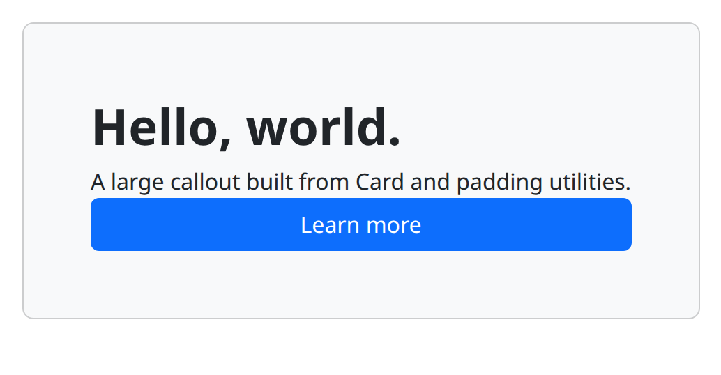
def demo():
    with bs.scope(), bs.card(class_name="p-5 mb-4 bg-body-tertiary rounded-3"):
        ui.label("Hello, world.").classes("fs-1 fw-bold")
        ui.label("A large callout built from Card and padding utilities.")
        bs.button("Learn more", color="primary")
Options
There is no Jumbotron type, so there are no jumbotron-only props. Tune the
recipe with classes on the Card:
- Padding:
p-5(orp-4on smaller screens of copy) is the usual hero inset. - Stacking:
mb-4separates the callout from the next section. - Surface:
bg-body-tertiary,bg-light, or a contextualbg-*class. - Corners:
rounded-3restores the soft hero shape Bootstrap 4 jumbotrons had.
Keep actions as Button children (or links) inside the card. The card is a
grouping container; put text in child elements rather than passing a raw string
if you need mixed heading levels.
Alternate recipe
A bordered, full-width hero is the same pattern with a different class set.
Still a Card, still not a separate component.
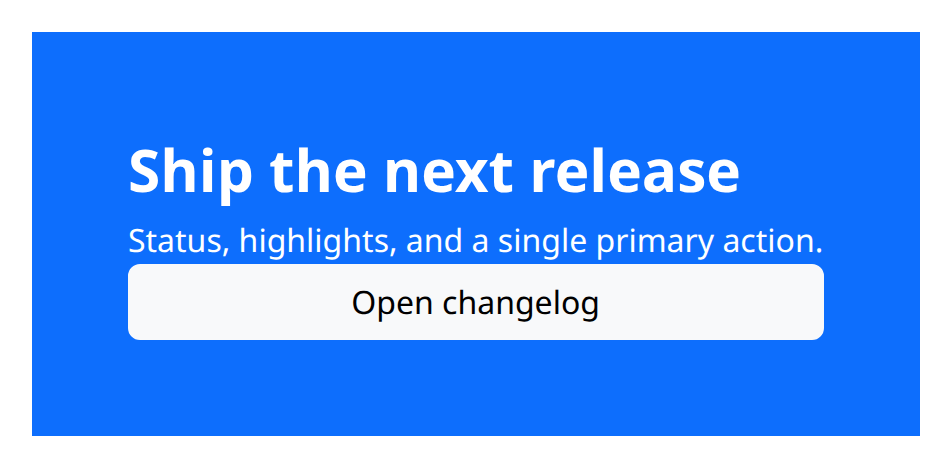
def demo():
    with bs.scope(), bs.card(class_name="p-5 border-0 bg-primary text-white rounded-0"):
        ui.label("Ship the next release").classes("fs-2 fw-bold")
        ui.label("Status, highlights, and a single primary action.")
        bs.button("Open changelog", color="light")
Notes
Because this page is a recipe, argument details below are for Card. Interactive
pieces you drop in (buttons, inputs) use NiceGUI callables such as on_click
and on_change; there is no jumbotron-level n_clicks.
Argument reference
| Property | Type | Default | DBC 2.0.4 name | Support (native) | Support (compat) |
|---|---|---|---|---|---|
| children | a list of or a singular dash component, string or number | None | children | supported | supported |
| id | string | None | id | supported | supported |
| color | string | None | color | supported | supported |
| body | boolean | None | body | supported | supported |
| outline | boolean | None | outline | supported | supported |
| inverse | boolean | None | inverse | supported | supported |
| style | unknown | None | style | supported | supported |
| class_name | string | None | className | supported | supported |
| key | string | None | key | unsupported | unsupported |
| class_name | string | None | className | supported | supported |