InputGroup
InputGroup is Bootstrap 5's clustered form control: an input flanked by text
add-ons, and optionally sized as a single unit. Use it for usernames, currency,
units, and other values where a short prefix or suffix is part of the field,
not a separate label.
Basic usage
Children render in order. An InputGroupText before the control prepends; one
after it appends. There are no prepend / append props — DBC-style
addon_type is not part of this API.
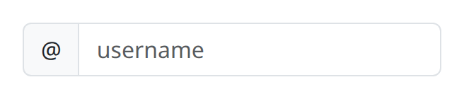
def demo() -> None:
    with bs.scope(), bs.input_group():
        bs.input_group_text("@")
        bs.input(placeholder="username")
Options
Prepend and append
Build both sides by putting text add-ons on either side of the input. The group is a single visual control; keep the add-on copy short so the field remains the focus.

def demo() -> None:
    with bs.scope(), bs.input_group():
        bs.input_group_text("$")
        bs.input(placeholder="Amount", type="number")
        bs.input_group_text(".00")
InputGroupText is phrasing content: a currency symbol, unit, or short word.
It has no extra layout props of its own; styling comes from being inside the
group.
size
size on InputGroup is "sm" or "lg" and scales the add-ons and the
control together. Prefer the group size over mixing an Input.size with a
different group size, which fights Bootstrap's alignment.

def demo() -> None:
    with bs.scope(), bs.input_group(size="lg"):
        bs.input_group_text("https://")
        bs.input(placeholder="example.com")
Inside a form
InputGroup nests cleanly in Form with Label and FormText. The label
still describes the value; the add-on only provides the prefix or unit. See
Form for validation feedback around the same cluster, and Input
for debounce, type, and placeholder on the inner control.
Notes
InputGroup is structural: it does not carry a value and has no n_clicks
handler. Put on_change / on_submit on the inner Input. Clickable add-ons
are regular Button children of the group, using on_click as elsewhere in
this library.
Argument reference
| Property | Type | Default | DBC 2.0.4 name | Support (native) | Support (compat) |
|---|---|---|---|---|---|
| children | a list of or a singular dash component, string or number | None | children | supported | supported |
| id | string | None | id | supported | supported |
| size | string | None | size | supported | supported |
| style | unknown | None | style | supported | supported |
| class_name | string | None | className | supported | supported |
| key | string | None | key | unsupported | unsupported |
| class_name | string | None | className | supported | supported |