Alert
Alert is an inline message used for feedback, status, and short notices. It maps
to Bootstrap 5's alert component (contextual color classes such as
alert-success). Reach for it when you need a prominent, in-flow message rather
than a toast or a modal.
Basic usage
Pass the message as the child and pick a contextual color. Build the widget
inside bs.scope() so Bootstrap styles are active on the page. The snippets
below are the same sources the demo service runs.
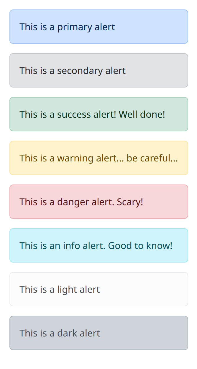
def demo() -> None:
    with bs.scope():
        bs.alert("This is a primary alert", color="primary")
        bs.alert("This is a secondary alert", color="secondary")
        bs.alert("This is a success alert! Well done!", color="success")
        bs.alert("This is a warning alert... be careful...", color="warning")
        bs.alert("This is a danger alert. Scary!", color="danger")
        bs.alert("This is an info alert. Good to know!", color="info")
        bs.alert("This is a light alert", color="light")
        bs.alert("This is a dark alert", color="dark")
alert is the snake_case alias for Alert. Either name constructs the same
native component; the dbc surface follows dash-bootstrap-components naming.
Link color
The Bootstrap alert-link class colors links inside an alert to match the
alert's own color.
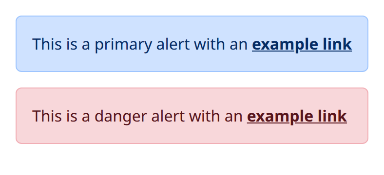
def demo() -> None:
    with bs.scope():
        with bs.alert(color="primary") as first:
            ui.label("This is a primary alert with an ").classes("d-inline")
            ui.link("example link", "#").classes("alert-link")
        with bs.alert(color="danger"):
            ui.label("This is a danger alert with an ").classes("d-inline")
            ui.link("example link", "#").classes("alert-link")
        del first
Additional content
Alerts can carry headings, paragraphs, and dividers.
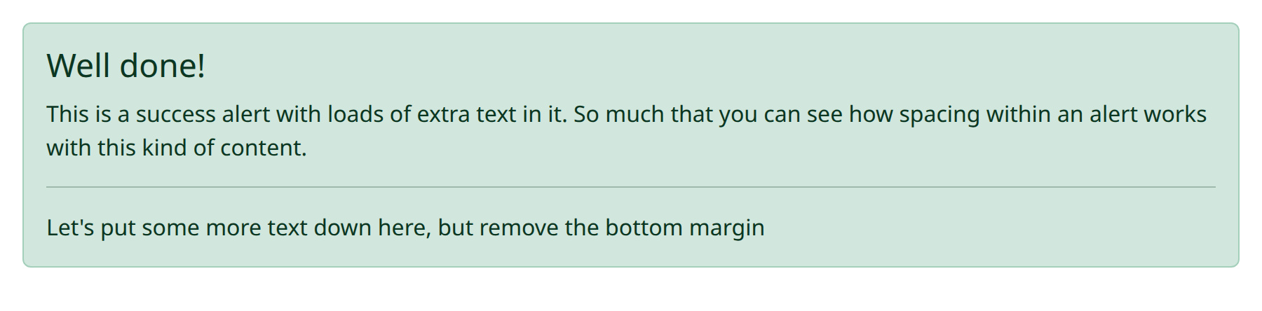
def demo() -> None:
    with bs.scope(), bs.alert(color="success"):
        ui.label("Well done!").classes("alert-heading h4")
        ui.label(
            "This is a success alert with loads of extra text in it. So much "
            "that you can see how spacing within an alert works with this "
            "kind of content."
        )
        ui.separator()
        ui.label("Let's put some more text down here, but remove the bottom margin").classes("mb-0")
Dismissing
Set dismissable=True to add a dismiss button, or drive is_open yourself.
fade=False disables the fade animation.
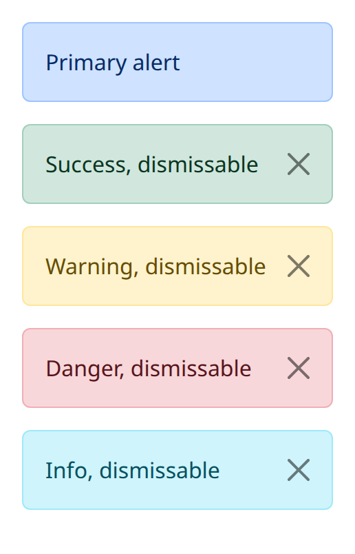
def demo() -> None:
    with bs.scope():
        bs.alert("Primary alert", color="primary")
        bs.alert("Success, dismissable", color="success", dismissable=True)
        bs.alert("Warning, dismissable", color="warning", dismissable=True)
        bs.alert("Danger, dismissable", color="danger", dismissable=True)
        bs.alert("Info, dismissable", color="info", dismissable=True)
Automatic dismissal
Pass duration (milliseconds) and the alert dismisses itself shortly after it
becomes visible.
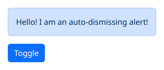
def demo() -> None:
    with bs.scope():
        alert = bs.alert(
            "Hello! I am an auto-dismissing alert!",
            is_open=True,
            duration=4000,
        )

        def toggle() -> None:
            alert.set_value(True)

        bs.button("Toggle", on_click=toggle).classes("me-1")
Icons
An icon from Bootstrap Icons (or Font Awesome) can lead the message.
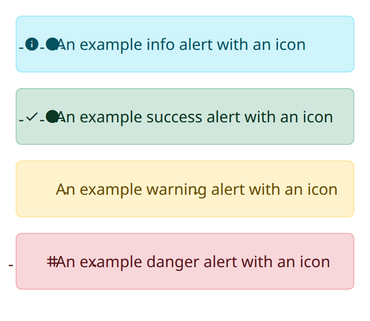
def demo() -> None:
    with bs.scope():
        with bs.alert(color="info").classes("d-flex align-items-center"):
            ui.icon("bi bi-info-circle-fill").classes("me-2")
            ui.label("An example info alert with an icon")
        with bs.alert(color="success").classes("d-flex align-items-center"):
            ui.icon("bi bi-check-circle-fill").classes("me-2")
            ui.label("An example success alert with an icon")
        with bs.alert(color="warning").classes("d-flex align-items-center"):
            ui.icon("bi bi-exclamation-triangle-fill").classes("me-2")
            ui.label("An example warning alert with an icon")
        with bs.alert(color="danger").classes("d-flex align-items-center"):
            ui.icon("bi bi-x-octagon-fill").classes("me-2")
            ui.label("An example danger alert with an icon")
Argument reference
| Property | Type | Default | DBC 2.0.4 name | Support (native) | Support (compat) |
|---|---|---|---|---|---|
| children | a list of or a singular dash component, string or number | None | children | supported | supported |
| id | string | None | id | supported | supported |
| is_open | boolean | True | isOpen | supported | supported |
| color | string | 'success' | color | supported | supported |
| dismissable | boolean | None | dismissable | supported | supported |
| duration | number | None | duration | supported | supported |
| fade | boolean | None | fade | supported | supported |
| style | unknown | None | style | supported | supported |
| class_name | string | None | className | supported | supported |
| persistence | boolean | string | number | None | persistence | unsupported | unsupported |
| persisted_props | list of a value equal to: 'is_open's | None | persisted_props | unsupported | unsupported |
| persistence_type | a value equal to: 'local', 'session', 'memory' | None | persistence_type | unsupported | unsupported |
| key | string | None | key | unsupported | unsupported |
| class_name | string | None | className | supported | supported |
Notes
Use alerts for durable, in-page status (form errors, empty states, permission
warnings). For ephemeral confirmation after a click, NiceGUI's ui.notify is
usually a better fit. Dash-style click counters are not the primary API on this
component; see the compatibility page for how interactive props are adapted to
NiceGUI.