Tabs
Tabs switch between peer panels of content in the same region. They map to Bootstrap
5 tabbed navigation (nav-tabs / nav-pills) and are the usual pattern for
settings pages, item inspectors, and any view where the user flips between a small
set of named sections.
Use Tabs when every panel is equally important and should stay mounted in the page. Use an Offcanvas or a separate route when a section is a destination of its own.
Basic usage
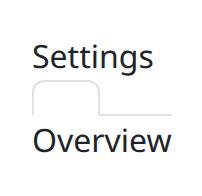
def demo() -> None:
    def on_change(_event: object) -> None:
        pass

    with bs.scope():
        bs.Tabs(
            bs.Tab("Overview"),
            bs.Tab("Settings"),
            active_tab="Overview",
            on_change=on_change,
        )
Compose Tabs with Tab children. Each Tab holds the panel body for that
section. active_tab selects which panel is shown first; on_change runs when the
user picks another tab.
Live example
The snippets below are exactly what the demo service runs. Each highlighted
demo() function is the same source the demo executes, not a rewritten copy.
Card tabs
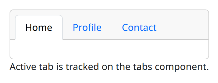
def demo() -> None:
    with bs.scope():
        tabs = bs.tabs(card=True)
        with tabs:
            bs.tab(label="Home")
            bs.tab(label="Profile")
            bs.tab(label="Contact")
        ui.label("Active tab is tracked on the tabs component.")
Tabs without ids
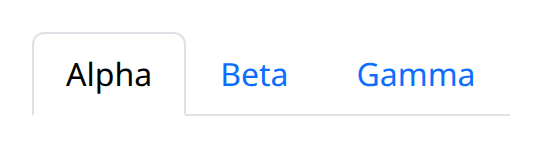
def demo() -> None:
    with bs.scope(), bs.tabs():
        bs.tab(label="Alpha")
        bs.tab(label="Beta")
        bs.tab(label="Gamma")
Options
Composition
Pass every panel as a Tab child of Tabs. The tab label and the panel content
come from that child. Keep the number of tabs small; a long row of labels is harder
to scan than a vertical nav.
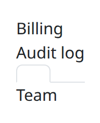
def demo() -> None:
    with bs.scope():
        bs.Tabs(
            bs.Tab("Team"),
            bs.Tab("Billing"),
            bs.Tab("Audit log"),
            active_tab="Team",
        )
Put structured widgets inside each Tab when the panel is more than a sentence.
The tab strip stays the navigation; the child is the page.
Active tab and on_change
active_tab is the identifier of the selected panel. Keep it in application state
so deep links, breadcrumbs, and the tab strip all agree. on_change is the Python
handler for a user-driven switch: persist the choice, lazy-load the panel, or sync
a URL parameter.
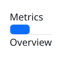
def demo() -> None:
    def on_change(_event: object) -> None:
        ui.notify("tab changed")

    with bs.scope():
        bs.Tabs(
            bs.Tab("Overview"),
            bs.Tab("Metrics"),
            active_tab="Overview",
            on_change=on_change,
            class_name="nav-pills",
        )
Do not rebuild the whole Tabs tree just to change the selection; update
active_tab and let the component restyle the strip.
Pills and card
class_name="nav-pills" switches the strip to Bootstrap's pill style instead of
underlined tabs. That style sits well on tinted headers and compact toolbars.
card wraps the strip and panels in a card-like frame so the tabs read as one
surface, which is useful on dashboards where the control is a standalone block.
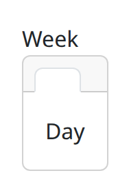
def demo() -> None:
    with bs.scope():
        bs.Tabs(
            bs.Tab("Day"),
            bs.Tab("Week"),
            card=True,
            active_tab="Day",
        )
Pill styling and card compose: nav-pills changes the labels, card changes the chrome. Use one
or both, but keep the choice consistent across the app so tab strips do not look
like different components.
Argument reference
| Property | Type | Default | DBC 2.0.4 name | Support (native) | Support (compat) |
|---|---|---|---|---|---|
| children | a list of or a singular dash component, string or number | None | children | supported | supported |
| id | string | None | id | supported | supported |
| active_tab | string | None | active_tab | supported | supported |
| style | unknown | None | style | supported | supported |
| class_name | string | None | className | supported | supported |
| persistence | boolean | string | number | None | persistence | unsupported | unsupported |
| persisted_props | list of a value equal to: 'active_tab's | None | persisted_props | unsupported | unsupported |
| persistence_type | a value equal to: 'local', 'session', 'memory' | None | persistence_type | unsupported | unsupported |
| key | string | None | key | unsupported | unsupported |
| class_name | string | None | className | supported | supported |